Introduction
Heatmaps are useful but can be difficult to customize appropriately. A critical issue is verifying the alignment between the main body of the heatmap and any marginal annotations and dendrograms.
The SummarizedExperiment class is designed to hold matrices together with optional descriptive data for column and rownames. Validation methods ensure these are always kept in order. The SummarizedHeatmap class is a derivative of this class with similar validation methods.
The approach is to start with a matrix, typically with samples as columns and genes or other features as rows. Values represent gene counts, cell counts or some other numeric value. Then create a SummarizedHeatmap object. Then add the desired colData and rowData to supply data for annotations. Clustering occurs with the construction of the SummarizedHeatmap object. A set of plotting functions is provided for the main heatmap body, column and row annotations, dendrograms, and highlights. The final heatmap is composed using patchwork.
Constructing a SummarizedHeatmap
First obtain a matrix of values. The columns and rows should be named.
set.seed(123)
mat <- matrix(rnorm(100), ncol=5)
colnames(mat) <- letters[1:5]
rownames(mat) <- letters[6:25]
Next use the constructor function to generate the heatmap.
library(blaseRtools)
library(SummarizedExperiment)
library(patchwork)
my_heatmap <- SummarizedHeatmap(mat)
my_heatmap
#> class: SummarizedHeatmap
#> dim: 20 5
#> metadata(0):
#> assays(1): matrix
#> rownames(20): f g ... x y
#> rowData names(0):
#> colnames(5): a b c d e
#> colData names(0):
Add column and row metadata. Here we show a trivial example. Usually you will want to extract this information from the same object that generated the matrix. For example, a cell_data_set object.
colData(my_heatmap)$sample_type <- c("vowel", "consonant", "consonant", "consonant", "vowel")

isVowel <- function(char) char %in% c('a', 'e', 'i', 'o', 'u')
rowData(my_heatmap)$feature_type <- ifelse(isVowel(letters[6:25]), "vowel", "consonant")
Use the “getter” functions to extract the metadata and check to be sure it was added correctly.
colData(my_heatmap)
#> DataFrame with 5 rows and 1 column
#>   sample_type
#>   <character>
#> a       vowel
#> b   consonant
#> c   consonant
#> d   consonant
#> e       vowel
rowData(my_heatmap)
#> DataFrame with 20 rows and 1 column
#>     feature_type
#>      <character>
#> f      consonant
#> g      consonant
#> h      consonant
#> i          vowel
#> j      consonant
#> ...          ...
#> u          vowel
#> v      consonant
#> w      consonant
#> x      consonant
#> y      consonant
For most cases, that is all you need to do. Variations are shown at the end.
Plotting
It is important to familiarize yourself with the patchwork package for composing plots. It is very useful for putting together complex figures and for compositing many panels into a single page for a publication or grant.
The approach here is to plot each element individually and then compose the elements into the final figure panel.
Critical: Although the SummarizedHeatmap object has validation checks, the plotting functions do not. This means that you can accidentally put the wrong dendrogram on a heatmap if you don’t check your code. Always follow good practice when coding these objects. Best practice is to wrap your plotting functions inside another function to control the scope of your variables. This looks more complicated to begin with but will become clear by the end.
Plot the main heatmap body
A simple example:
my_heatmap_plot_function <- function(hm) {
  p1 <- bb_plot_heatmap_main(hm)
  p1
}
my_heatmap_plot_function(my_heatmap)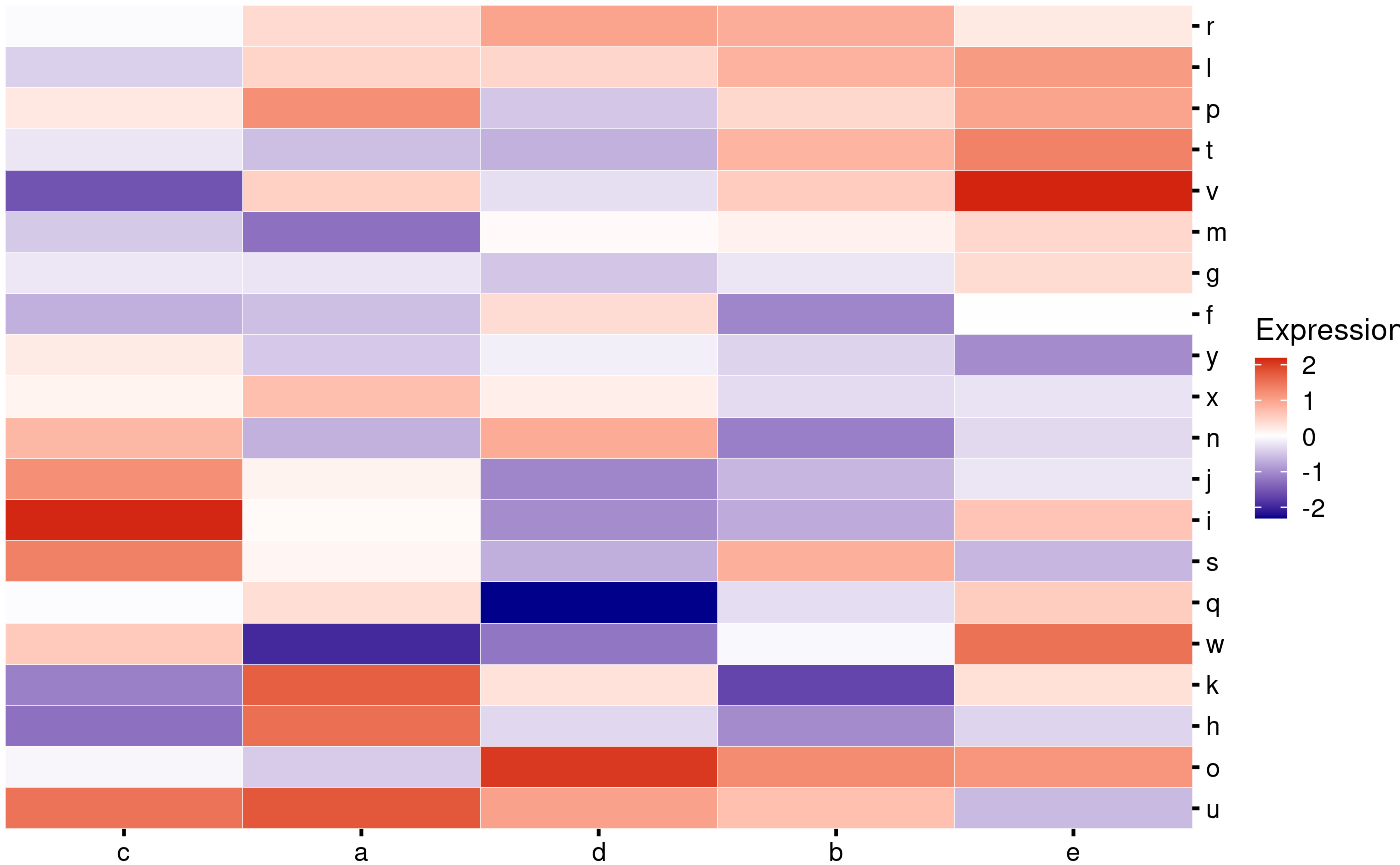
Change the color palette:
my_heatmap_plot_function <- function(hm) {
  p1 <- bb_plot_heatmap_main(hm, high = "purple", mid = "black", low = "yellow")
  p1
}
my_heatmap_plot_function(my_heatmap)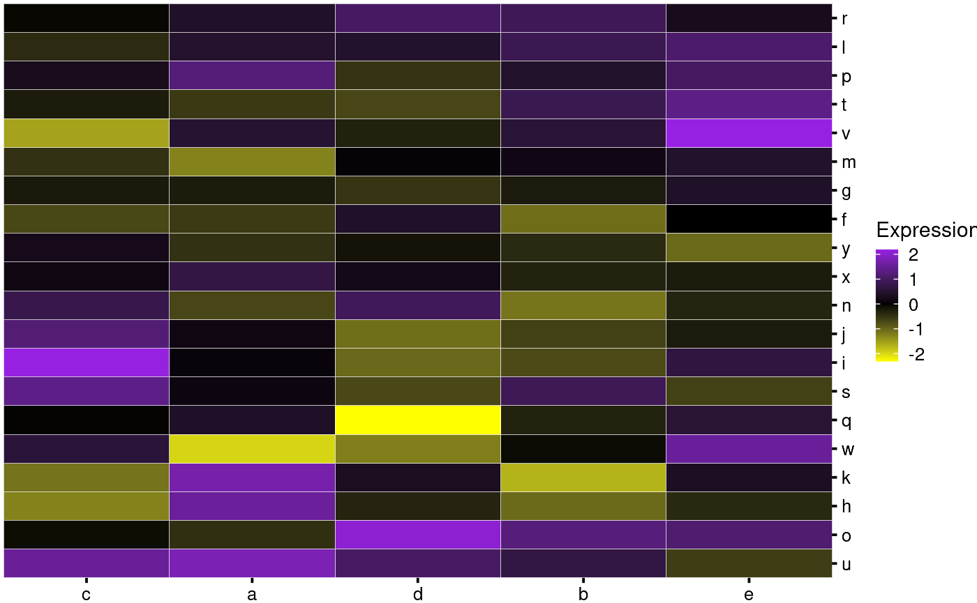
All plotting functions return ggplots, so if an internal parameter you want to change is not available, you can do so by adding layers:
my_heatmap_plot_function <- function(hm) {
  p1 <- bb_plot_heatmap_main(hm) +
    labs(fill = "Expr.") +
    geom_tile(color = "black") +
    theme(axis.text = element_blank(),
          axis.ticks = element_blank())
  p1
}
my_heatmap_plot_function(my_heatmap)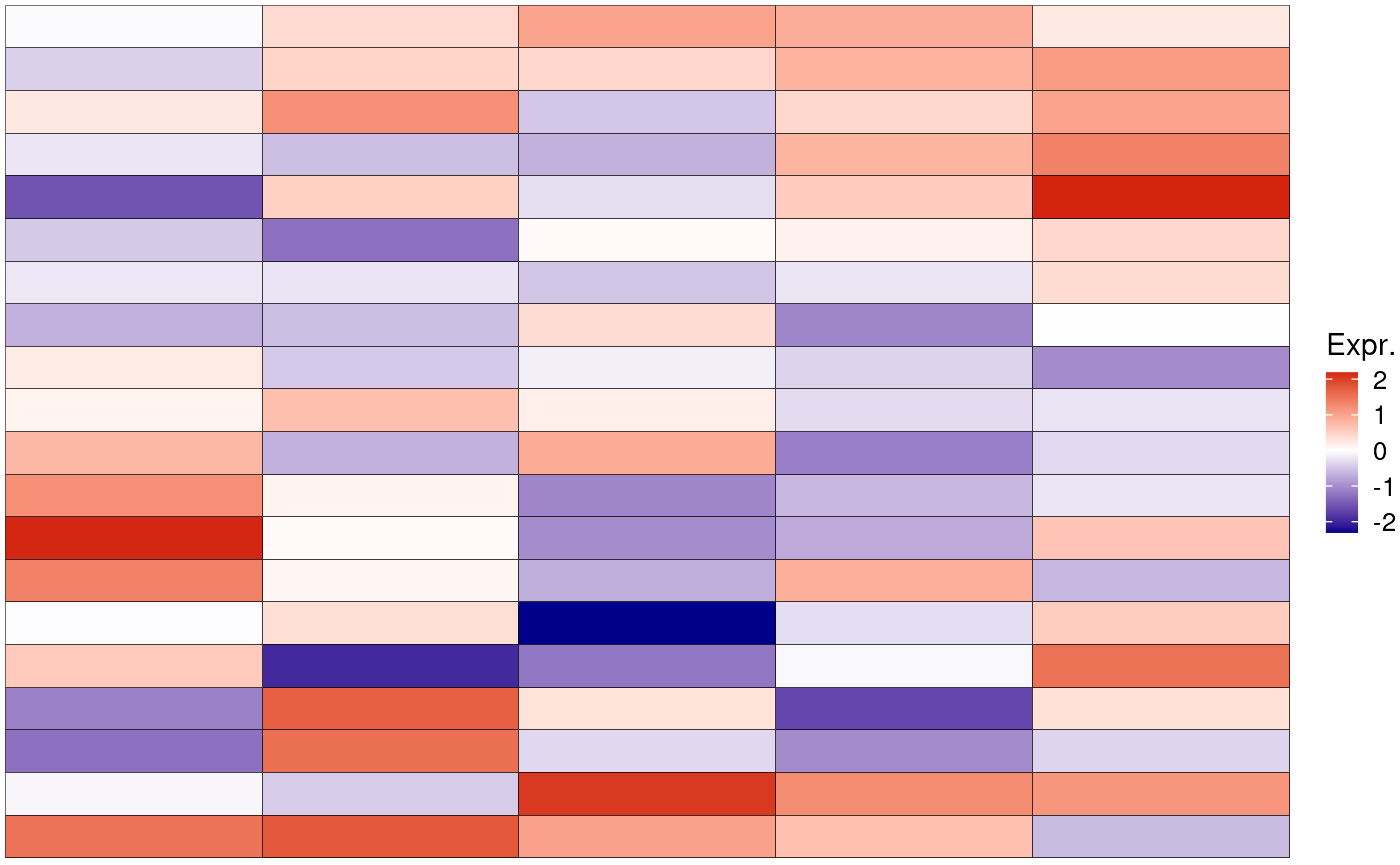
Adding dendrograms
You make the column and row dendrograms using their own functions:
bb_plot_heatmap_colDendro(my_heatmap)
bb_plot_heatmap_rowDendro(my_heatmap)
These are not so useful on their own, so we can incoporate them into the heatmap like this. Note how we are using the patchwork to make the layout
my_heatmap_plot_function <- function(hm) {
  p1 <- bb_plot_heatmap_main(hm)
  p2 <- bb_plot_heatmap_colDendro(hm)
  p3 <- bb_plot_heatmap_rowDendro(hm)
  p4 <- guide_area()

  design <- "
  #2#
  314
  "
  p1 + p2 + p3 + p4 + plot_layout(design = design,
                             guides = "collect",
                             widths = c(1, 8, 1),
                             heights = c(1, 8))
}
my_heatmap_plot_function(my_heatmap)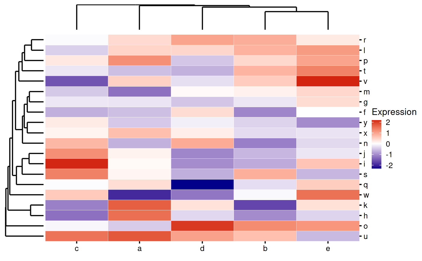
Currently the only aesthetic you can change for the dendrograms is linewidth:
my_heatmap_plot_function <- function(hm) {
  p1 <- bb_plot_heatmap_main(hm)
  p2 <- bb_plot_heatmap_colDendro(hm, linewidth = 3)
  p3 <- bb_plot_heatmap_rowDendro(hm)
  p4 <- guide_area()

  design <- "
  #2#
  314
  "
  p1 + p2 + p3 + p4 + plot_layout(design = design,
                             guides = "collect",
                             widths = c(1, 8, 1),
                             heights = c(1, 8))
}
my_heatmap_plot_function(my_heatmap)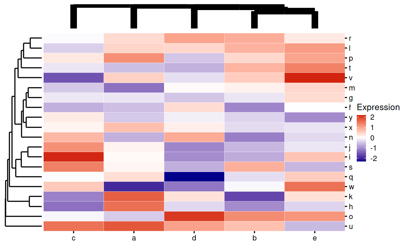
Row and Column Annotations
Adding column annotations:
my_heatmap_plot_function <- function(hm) {
p1 <- bb_plot_heatmap_main(hm)
p2 <- bb_plot_heatmap_colDendro(hm)
p3 <- bb_plot_heatmap_rowDendro(hm)
p4 <- guide_area()
p5 <- bb_plot_heatmap_colData(hm)
design <- "
#2#
#54
314
"
p1 + p2 + p3 + p4 + p5 + plot_layout(
design = design,
guides = "collect",
widths = c(1, 8, 1),
heights = c(1, 1, 8)
)
}
my_heatmap_plot_function(my_heatmap)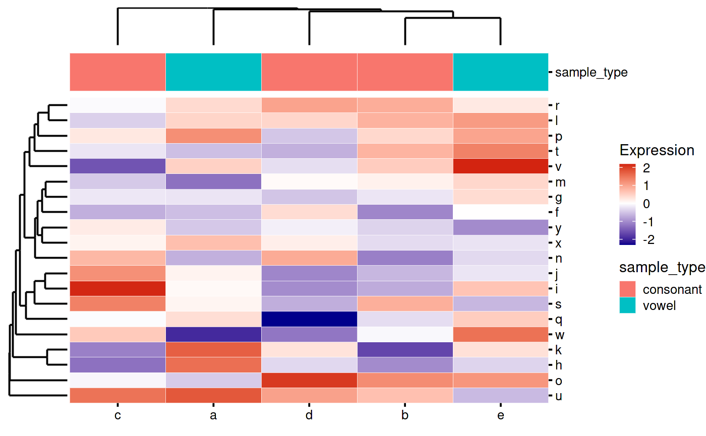 Adding row annotations:
my_heatmap_plot_function <- function(hm) {
  p1 <- bb_plot_heatmap_main(hm)
  p2 <- bb_plot_heatmap_colDendro(hm)
  p3 <- bb_plot_heatmap_rowDendro(hm)
  p4 <- guide_area()
  p5 <- bb_plot_heatmap_rowData(hm)


  design <- "
  ##2#
  3514
  "
  p1 + p2 + p3 + p4 + p5 + plot_layout(
    design = design,
    guides = "collect",
    widths = c(1, 1, 8, 2),
    heights = c(1, 8)
  )
}
my_heatmap_plot_function(my_heatmap)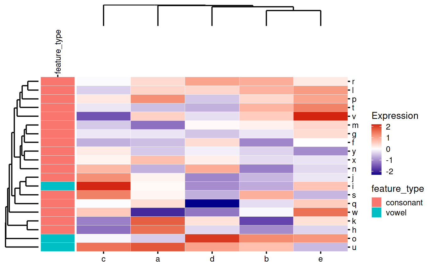
That looks weird because patchwork is leaving space for the “feature_type” text. You can tell it to override this like so:
my_heatmap_plot_function <- function(hm) {
  p1 <- bb_plot_heatmap_main(hm)
  p2 <- bb_plot_heatmap_colDendro(hm)
  p3 <- bb_plot_heatmap_rowDendro(hm)
  p4 <- guide_area()
  p5 <- bb_plot_heatmap_rowData(hm)


  design <- "
  ##2#
  3514
  "
  p1 + p2 + p3 + p4 + free(p5, side = "t", type = "space") + plot_layout(
    design = design,
    guides = "collect",
    widths = c(1, 1, 8, 2),
    heights = c(2, 8)
  )
}
my_heatmap_plot_function(my_heatmap)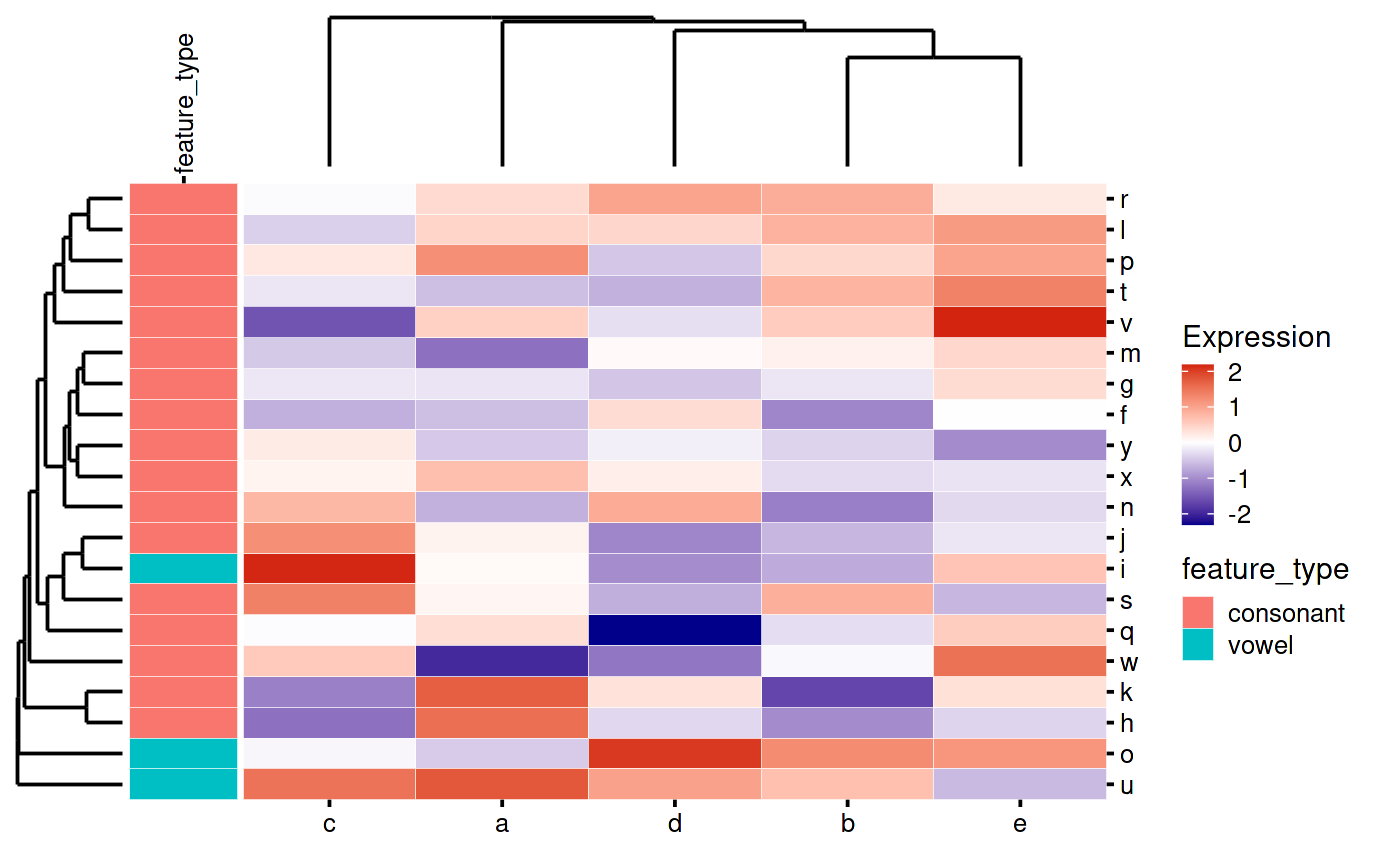
You can also move the annotation text to the other side:
my_heatmap_plot_function <- function(hm) {
  p1 <- bb_plot_heatmap_main(hm)
  p2 <- bb_plot_heatmap_colDendro(hm)
  p3 <- bb_plot_heatmap_rowDendro(hm)
  p4 <- guide_area()
  p5 <- bb_plot_heatmap_rowData(hm) +
    scale_x_discrete() +
    theme(axis.text.x = element_text(angle = 90, vjust = 0.5))


  design <- "
  ##2#
  3514
  "
  p1 + p2 + p3 + p4 + p5 + plot_layout(
    design = design,
    guides = "collect",
    widths = c(1, 1, 8, 2),
    heights = c(2, 8)
  )
}
my_heatmap_plot_function(my_heatmap)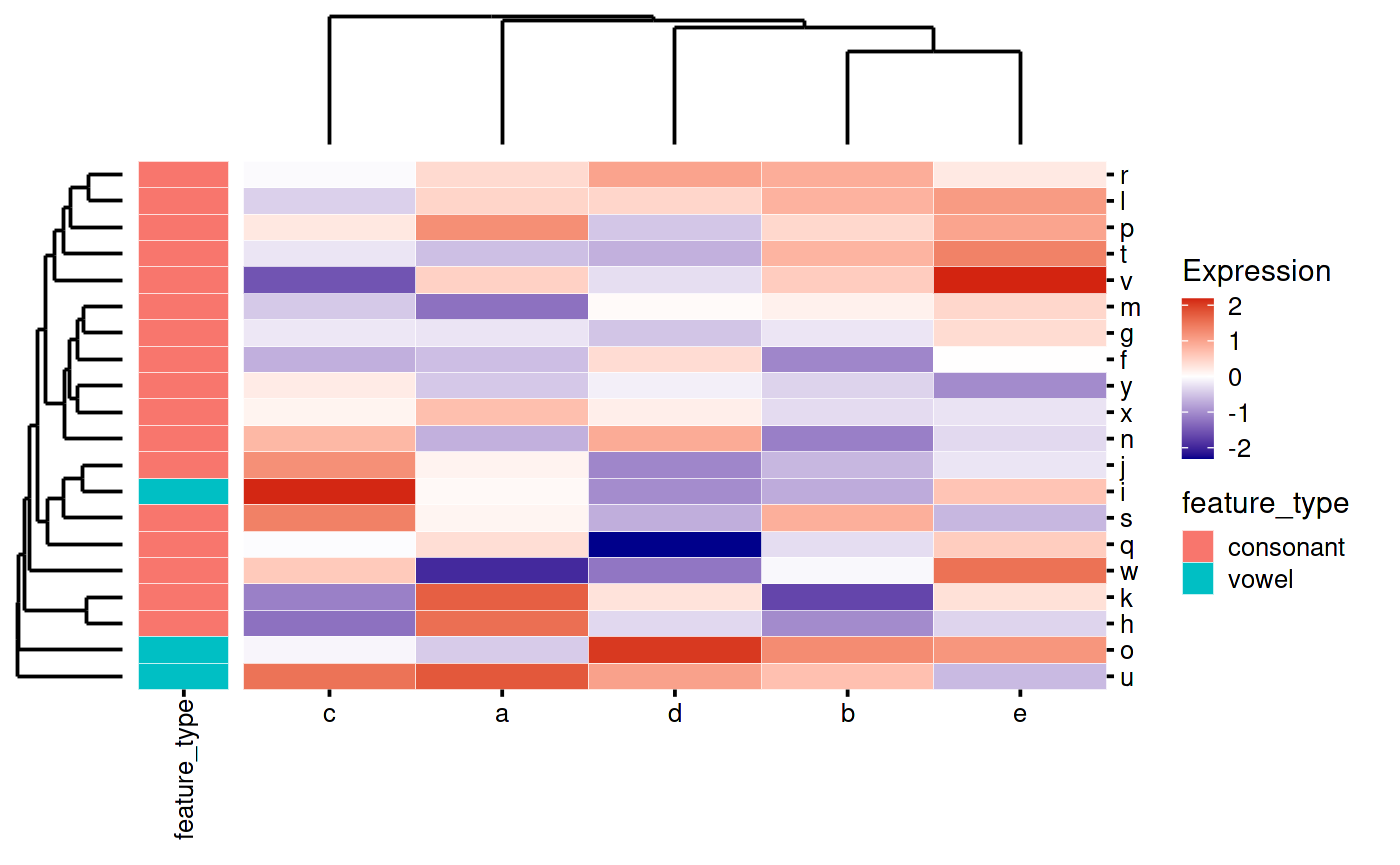
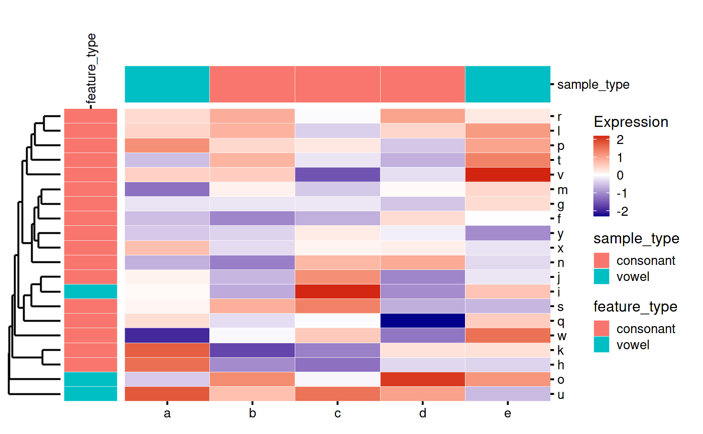
You can add row and column annotations together:
my_heatmap_plot_function <- function(hm) {
  p1 <- bb_plot_heatmap_main(hm)
  p2 <- bb_plot_heatmap_colDendro(hm)
  p3 <- bb_plot_heatmap_rowDendro(hm)
  p4 <- guide_area()
  p5 <- bb_plot_heatmap_colData(hm)
  p6 <- bb_plot_heatmap_rowData(hm)

  design <- "
  ##2#
  ##54
  3614
  "
  p1 + p2 + p3 + p4 + p5 + free(p6, side = "t", type = "space") + plot_layout(
    design = design,
    guides = "collect",
    widths = c(1, 1, 8, 1),
    heights = c(1, 1, 8)
  )
}
my_heatmap_plot_function(my_heatmap)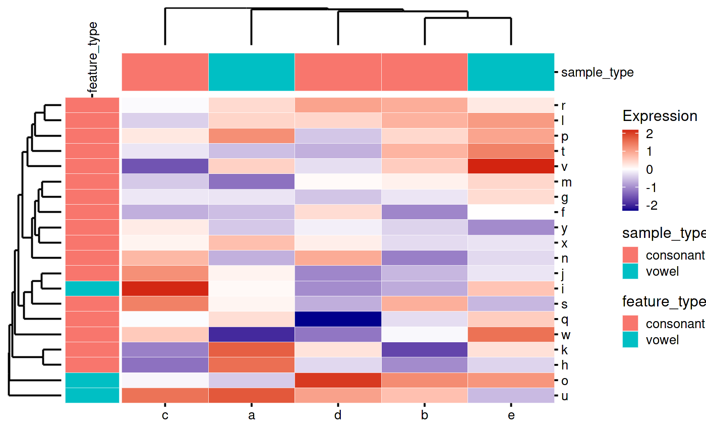
Heatmap Highlights
Sometimes you have too many rows or columns on your plot and you want to cherry pick a few to show your reader.
- Remove the axis text using ggplot layers
- Add a new plot with the highlights to the patchwork:
my_heatmap_plot_function <- function(hm) {
  p1 <- bb_plot_heatmap_main(hm) +
    theme(axis.text.y = element_blank(),
          axis.ticks.y = element_blank())
  p2 <- bb_plot_heatmap_colDendro(hm)
  p3 <- bb_plot_heatmap_rowDendro(hm)
  p4 <- guide_area()
  p5 <- bb_plot_heatmap_colData(hm)
  p6 <- bb_plot_heatmap_rowData(hm)
  p7 <- bb_plot_heatmap_rowHighlight(hm, highlights = c("l", "m", "n"))

  design <- "
  ##2##
  ##5#4
  36174
  "
  p1 +
    p2 +
    p3 +
    p4 +
    free(p5, side = "r", type = "space") +
    free(p6, side = "t", type = "space") +
    p7 +
    plot_layout(
    design = design,
    guides = "collect",
    widths = c(1, 1, 8, 1, 2),
    heights = c(1, 1, 8)
  )
}
my_heatmap_plot_function(my_heatmap)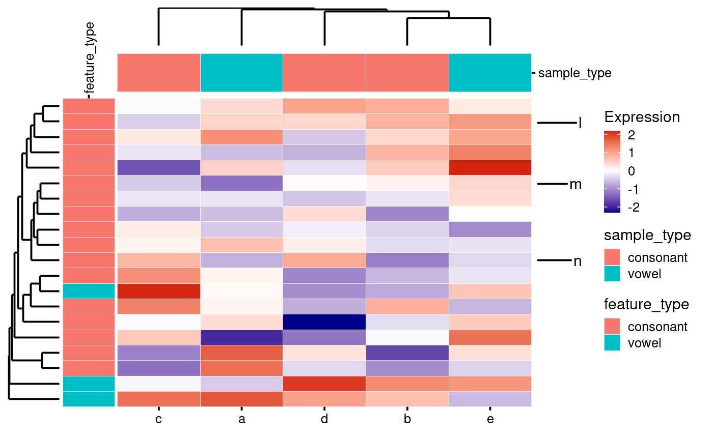
Customization
Here is another example with more customizations.
- Custom color palettes for annotations
- Selecting which annotations to show
- Renaming the labels for annotations
mat <- matrix(rnorm(100), ncol = 5)

sample_data <- tibble(
  the_letters = letters[1:5],
  sample_type = c("vowel", "consonant", "consonant", "consonant", "vowel"),
  sample_type2 = c("vowel2", "consonant2", "consonant2", "consonant2", "vowel2")
)
isVowel <- function(char)
  char %in% c('a', 'e', 'i', 'o', 'u')
feature_data <- tibble(
  the_letters = letters[6:25],
  feature_type = ifelse(isVowel(the_letters), "vowel", "consonant"),
  feature_type2  = paste0(feature_type, "2")
)

colnames(mat) <- sample_data$the_letters
rownames(mat) <- feature_data$the_letters

my_custom_heatmap <- SummarizedHeatmap(mat)

colData(my_custom_heatmap) <-
  DataFrame(sample_data, row.names = sample_data$the_letters)
rowData(my_custom_heatmap) <-
  DataFrame(feature_data, row.names = feature_data$the_letters)

my_custom_heatmap_plotting_function <- function(hm) {
  p1 <- bb_plot_heatmap_colDendro(hm)
  p2 <- bb_plot_heatmap_rowDendro(hm, side = "left")
  p3 <- bb_plot_heatmap_colData(
    hm,
    vars = c("Sample Type" = "sample_type",
             "Sample Type 2" = "sample_type2"),
    manual_pal = c(
      "consonant" = "ivory",
      "vowel" = "pink",
      "consonant2" = "cornsilk",
      "vowel2" = "pink3"
    )
  )
  p4 <- bb_plot_heatmap_rowData(
    hm,
    vars = c("Feature Type" = "feature_type",
             "Feature Type2" = "feature_type2"),
    manual_pal = c(
      "consonant" = "ivory3",
      "vowel" = "pink4",
      "consonant2" = "bisque1",
      "vowel2" = "lightpink3"
    )
  )


  p5 <- bb_plot_heatmap_main(hm, tile_color = "white")

  p6 <- guide_area()
  design <- "
##1#
##36
2456

"
p1 +
  p2 +
  free(p3, side = "r",  type = "space") +
  free(p4, side = "t", type = "space") +
  p5 +
  p6 +
  plot_layout(
  design = design,
  widths = c(.1, .2, 1, 0.5),
  heights = c(.1, .2, 1),
  guides = "collect"
)

}

my_custom_heatmap_plotting_function(my_custom_heatmap)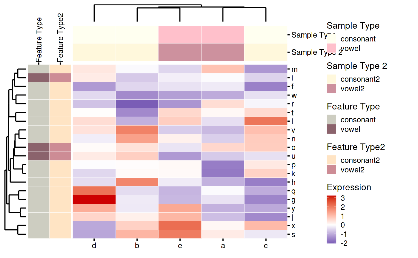
Other variations
Transposing the plot
By convention we normally put samples as columns and features as rows. This is not strictly enforced by the object. So it is possible to transpose the matrix and swap the colData/rowData when making the SummarizedHeatmap object. Another option is to flip the heatmap and all of the annotations. You do this by flipping the main heatmap body and setting the sides of the annotations and dendrograms the way you like. (You can also use this to put the annotations on any side, whether or not you flip the main heatmap).
my_flipped_heatmap_plot_function <- function(hm) {
  p1 <- bb_plot_heatmap_main(hm, flip = TRUE)
  p2 <- bb_plot_heatmap_colDendro(hm, side = "left")
  p3 <- bb_plot_heatmap_colData(hm, side = "left")
  p4 <- bb_plot_heatmap_rowDendro(hm, side = "top")
  p5 <- bb_plot_heatmap_rowData(hm, side = "top")
  p6 <- guide_area()
  p7 <-
    bb_plot_heatmap_colHighlight(hm,
                                 highlights = c("a", "b", "c"),
                                 side = "right")
  p8 <-
    bb_plot_heatmap_rowHighlight(hm,
                                 highlights = c("w", "s", "v"),
                                 side = "bottom")

  design <- "
##4#6
##5#6
23176
##8##
"

p1 +
  p2 +
  free(p3, side = "t", type = "space") +
  p4 +
  free(p5, side = "r", type = "space") +
  p6 +
  p7 +
  p8 +
  plot_layout(
    design = design,
    guides = "collect")
}
my_flipped_heatmap_plot_function(my_heatmap)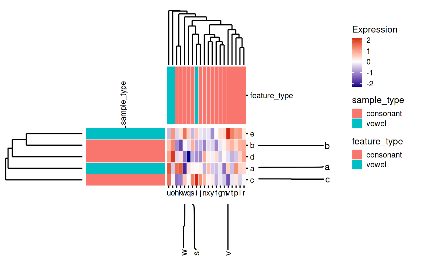
Manual ordering
Usually clustering rows and columns produces a more interpretable figure, but on rare occasions you may wish to manually establish the order of columns or rows.
To do this, provide a character vector corresponding to this order to the constructor function. Note that you cannot manually specify row/column order and retain a dendrogram for that dimension.
set.seed(123)
mat <- matrix(rnorm(100), ncol = 5)
colnames(mat) <- letters[1:5]
rownames(mat) <- letters[6:25]

my_ordered_heatmap <-
  SummarizedHeatmap(mat, colOrder = letters[1:5])
colData(my_ordered_heatmap) <-
  DataFrame(sample_data, row.names = sample_data$the_letters)
rowData(my_ordered_heatmap) <-
  DataFrame(feature_data, row.names = feature_data$the_letters)
# set col order
my_ordered_heatmap_plot_function <- function(hm) {
  p1 <- bb_plot_heatmap_main(hm)
  p2 <- plot_spacer()
  p3 <- bb_plot_heatmap_colData(hm, vars = c("sample_type"))
  p4 <- bb_plot_heatmap_rowDendro(hm)
  p5 <- bb_plot_heatmap_rowData(hm, vars = c("feature_type"))
  p6 <- guide_area()

  design <- "
##2#
##36
4516
"
p1 +
  p2 +
  free(p3, side = "r", type = "space") +
  p4 +
  free(p5, side = "t", type = "space") +
  p6 +
  plot_layout(design = design,
              guides = "collect",
              heights = c(1, 1, 8),
              widths = c(1, 1, 8, 2))
}
my_ordered_heatmap_plot_function(my_ordered_heatmap)